

What do we Know?

March 18, 2026
If you are a consistent reader of our editions, perhaps you noticed the absence of our emails hitting your inbox of late. To be precise, February 26th was our last edition. This turned out to be just two days prior to the launch of Operation Epic Fury.
From that launch date, visibility for collective market participants, across the board, went very murky. Said visibility also went murky for those who offer economic prognostications.
Regardless of the chosen focus, from markets to economic forecasting to even geopolitical analysis, downstream visibility quickly became quite blurred.
With this, for our part, offering a topic since our previous published edition seemed irrelevant in light of the above visibility issue. Even referencing collective market participant behaviors across various markets seemed irrelevant, realizing one new headline could change that perspective in a few minutes.
With this backdrop, we have found ourselves soliciting the help of one of our favorite questions: What do we know?
You see, when everything is murky, this question offers centering and some level of grounding. It is a baseline, rock-bottom type of question.
Through this question, it allows us to walk away from what seems like an impossible situation when working to project forward scenarios to an endpoint of drilling them down to market(s) positioning, to something at least a bit manageable.
The question customarily leads to being able to quantify more than we initially would think in light of the general confusion radiating from the large-scale issue at hand.
Below we share one answer that surfaced in our questioning, which we have actually addressed throughout numerous editions over recent years. We have addressed this topic through various angles to help in presentation: thinking different angles may aid in driving this reality into the conscious awareness of anyone reading.
Interestingly, the events of recent weeks further drive home our observation of recent years relative to this topic.
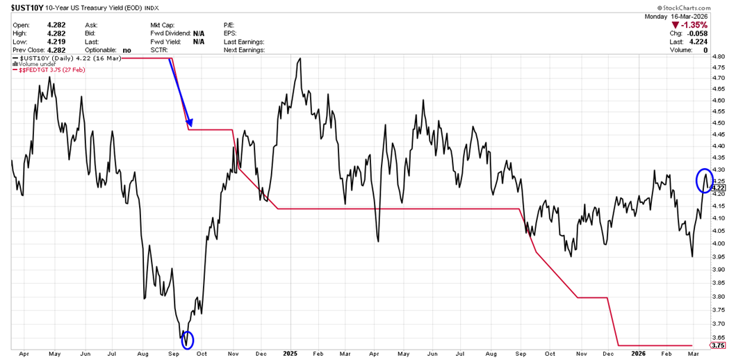
Click For Larger View: https://schrts.co/MaAsvDHz
The above dates back to the spring of 2024 up to the current day. The red line is the Federal Reserve’s fed funds rate. This rate is set by the Fed’s interest rate policy committee.
The black line is the benchmark 10-year treasury note shared on a yield basis – think interest rate level. This rate is set by collective bond market participants via their daily market operations.
In the left portion of the chart, September of 2024 to be precise, the Fed cut rates for the first time in this cycle. Our blue arrow denotes the day of the ½ point cut back then. Our blue circle below it denotes the level the 10-year treasury was at on that day.
You can visually see the clear and continued reduction in the Fed’s benchmark rate as time moved on via the red line. You can also visually note, to the far right of the chart, how the blue circle for the 10-year treasury (black line) currently resides at a higher level than what it was back in September of 2024.
The bottom line of this is while the Fed cut rates again and again, for their part, collective bond market participants have actually increased the interest rate of this key benchmark treasury note.
This continues to underline the fact that those who believe the Fed is the key to interest rates, across the interest rate spectrum, are mistaken. The most important aspect to the broad interest rate storyline remains with collective bond market participants.
If they are not willing to bid treasuries up in price, which results in lower yield (think interest rate), then broad interest rates will not be moving lower. Since the Fed began cutting rates back in September of 2024, bond market participants have not been willing to chime in with the Fed’s direction of rates.
Mortgage rates, for example, take their directional cue from benchmark treasury securities such as the 10-year treasury note. With this in mind, since the Fed began cutting rates back in September of 2024, the national average 15-year mortgage rate is also higher now than it was back in the fall of 2024.
If you hear someone offer how the Fed needs to cut rates further so we can get mortgage rates lower to help potential home buyers, we invite you to recall the above relationship chart as a guide to what really drives mortgage rates.
To impress bond market participants, if you will, a starting point would be for the issuer of treasury securities (think treasury department, i.e., government) to get serious about the fiscal policy that has devolved in recent years, to include up to the current day, of $1.5 to $2.5 trillion annual budget deficits as normal operations.
(Historically, those type of numbers were registered during extreme financial crisis, not as a fiscal norm.)
Until then, do not be surprised to see what we have been seeing in the above chart. That is, bond market participants that are less than enthusiastic about bidding treasuries higher on a notable price trend, which, in turn, would push the benchmark treasury interest rates notably lower.
At a time of geopolitical upheaval, “flight to safety” is an operative phrase that has unfolded in various markets. Interestingly, and underlining the above, bond market participants have not included treasuries as part of the flight to safety trade.
In fact, in recent weeks, said participants have actually pushed treasury rates higher by selling off treasuries rather than looking at them as a safe harbor for capital. You can see this if you reference the above chart again and look to the far right at the black line’s behavior in the month of March.
As we have offered in previous editions, if you really want to know what general interest rates are doing, watch the 10-year treasury note, which will inform you of collective bond market participants’ view of the general landscape. Through that observation, as an example, you will also be informed of the expected path of mortgage rates.
I wish you well…
-Ken from Mind Your Stops