

Keep in mind, Price Inflation has a Long History of Double Peaks

May 7, 2026
Since the launch of Operation Epic Fury back on February 28th, we have shared fewer editions than what had been customary up to that point in time.
Through all the noise in the geopolitical landscape since late February, coupled with a high noise level in the socioeconomic backdrop domestically, we have chosen to share less in an attempt to step back a bit and share observations that cut through some of the noise rather than tossing more of it into the proverbial ether.
In an edition just over a month ago we attempted to cut through the noise that price inflation was no longer a thing. Seemingly, anytime price inflation as a topic saw the light of day, it was quickly brushed off as though it was a historical artifact.
In light of ongoing military operations following the launch of Epic Fury, price inflation was entertained again, suggesting it would be a near-term issue - but it would surely be short-lived.
As we shared a month ago and do so again in today’s edition, the problem with the past-tense view of the price inflation issue is that it is an incorrect view.
To be fair and accurate, its growth rate certainly reduced off notably high levels, but importantly, it has continued to print a growth rate above historical levels that would offer that it is a nonissue.
Below we share some additional perspective with updated data since our last edition on this topic.
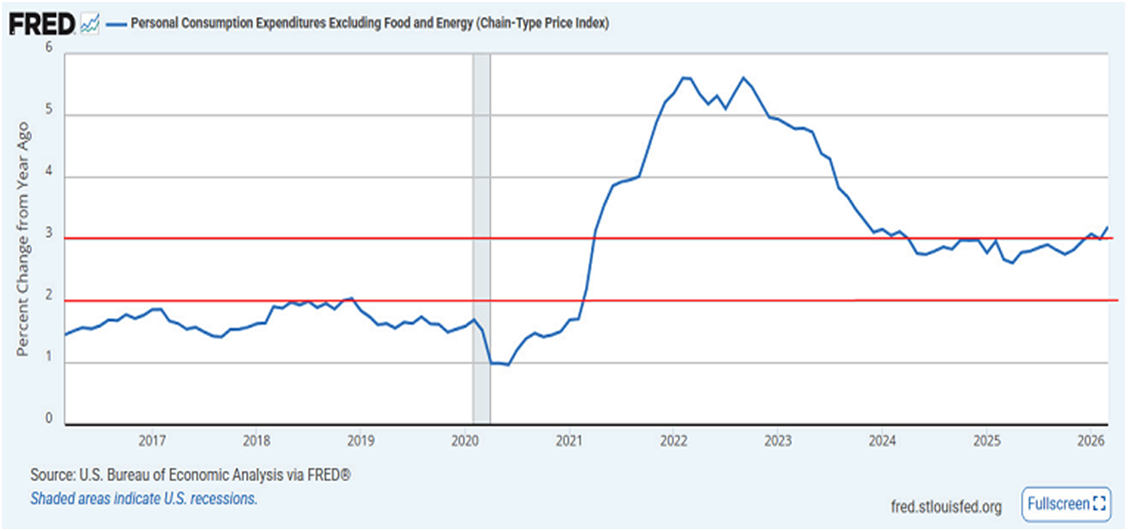
Click For Larger View: https://fred.stlouisfed.org/graph/?g=1VU55
Above is a ten-year view of the PCE index, which stands for the Personal Consumption Expenditure Chain-type Price Index. We offer this because it is the Federal Reserve’s preferred measure for price inflation.
Importantly, relative to the above chart, we are sharing the PCE index that excludes food and energy. This is known as the core PCE index and is meant to aid in giving a view of what the price inflation trend looks like throughout the pricing structure, without those two more volatile components skewing the underlying price trends.
In light of the aforementioned military operations, anytime price inflation has arisen as a topic of late, the focus is always on energy and how that will be a problem. This always implies that if not for energy and the expectations of its downstream impact, the price inflation backdrop is fine. To the contrary.
In the above chart, we offer two red horizontal lines. The lower line represents the 2% level for this core PCE index. The Fed offers ad nauseam that they have a 2% target level. Per our lower red line, we can see that is a target level that we have not experienced in over 5 years! It gets worse.
The upper red line denotes the 3% growth rate level. Note how in the left portion of the timeline of the chart we had not exceeded the 2% lower red line, while the upper 3% red line was an unfathomable experience.
Turn your attention towards the right portion of the timeline of the chart and note the extreme differences. Per the chart, 3% is becoming more of a baseline experience rather than some unfathomable experience of years previous. Sadly, it gets even worse.
Note to the far right portion of the chart how the most recent update of this data reflects this Core PCE index is putting in a higher high while it breaks higher off of the 3% level. The most recent update covers up through the month of March, whereby it reflects a 3.2% growth rate year/year.
Importantly, keep in mind this is the core PCE index, which excludes food and energy. The reality above discredits the view that price inflation has been a nonissue in 2025 and up through here in early 2026.
An Invitation
To explicitly belabor the above point, I invite you to do a visual exercise with the above chart.
Place your gaze on the center of the chart and let your peripheral vision denote to you the extreme contrast, via the red lines as markers, of the two completely different price inflation experiences to the left and to the right of your center gaze.
It is literally the tale of two completely different price inflation storylines. And yet, supposedly, we do not have a price inflation issue.
As an aside, we will cross talk here in terms of topics; if you wonder why mortgage rates, as only one example, are not moving lower, revisit the above chart. Price inflation is the bane of bond market participants. Ultimately, it is bond market participants who set the cost of capital – think, interest rate – to include mortgage rates.
Onward to our subject Title
Over recent years we have occasionally shared a very long view of price inflation in the United States. We thought it timely to share the long view once again.
Below, we offer a 100-plus year view of price inflation courtesy of Ron Griess over at the Chart Store.
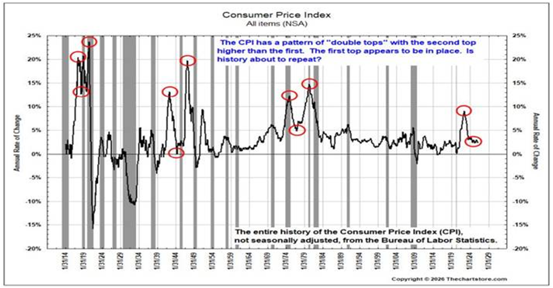
The above dates back to the early 1900’s for a long timeline perspective. The central observation point of the above price inflation history is how consistent double peaks are when a notable price inflation era initially breaks out.
Follow the red circles, from the initial breakout, to pullback, to another breakout that exceeds the initial breakout, along the historical timeline above. To the far right is our current price inflation era.
How will this era unfold?
As we stand currently, per the initial chart and data shared, we are not off to a good start if we are hoping to negate the above historical price inflation storylines of double peaks.
To be certain, time will tell her story on this. We will share accordingly along the path as the price inflation storyline unfolds.
I wish you well…
-Ken from Mind Your Stops