


July 15, 2026
Fitting with the summer season and how many share pictures of a summer getaway, we thought we would take a similar approach toward reviewing the employment landscape for this edition.
With this, below we offer several pictures of the employment backdrop to share perspective of this strange employment market.
First is what we have often labeled as a tip of the spear for gauging the health of the employment landscape. To be fair, this is a bit of an exaggeration but used as such to underline its importance. If it is not the literal tip of the spear, it is one metric that earns its place close to it.
https://fred.stlouisfed.org/graph/?g=1X3Ny
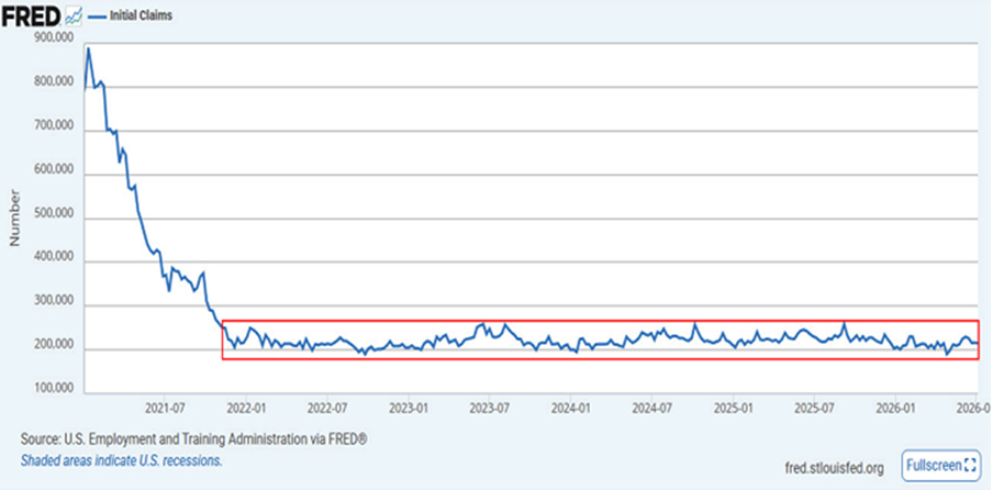
The above depicts the weekly unemployment insurance claims dating back to the beginning of 2021.
Historically speaking, when these claims push up into the 350-400 thousand range, they offer a tremendous concern of recession. Dating back to late 2021, our red rectangle highlights how consistently low these initial claims have remained throughout the period.
These are released every Thursday morning, which gives a frequent update with each passing week. The most recent release reflected 215,000 claims, which continues to post very low levels.
The range depicted has posted a high point of 260,000 a few times, along with lows of 190,000 a few times as well. The current 215,000 print reflects the continued steadiness of this employment indicator. This is remarkable in its stability for the five-plus years depicted.
The well-recognized monthly employment results – i.e., the new jobs created metric
https://fred.stlouisfed.org/graph/?g=1X3Pl
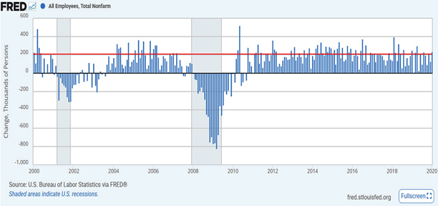
The above dates back to the year 2000 and walks us up to 2020. We are noting the first two decades of this 21st century to place our next chart into context.
The red line above represents 200,000 new jobs created each month. Each blue bar represents one month.
Note how consistent the new jobs created number has been relative to the 200,000 red line. It was more typical than not for the red line to be exceeded, touched, or come in marginally below the level of 200,000 new jobs.
The two periods denoting recession (vertical light blue shaded areas) are the exception, which is as expected when going into, through, and coming out of a recession. Outside of that, 200,000 was not an aberration or a notable achievement. Such a result was often viewed as pedestrian.
Now, 200,000 new jobs are met with celebration
https://fred.stlouisfed.org/graph/?g=1X3PK
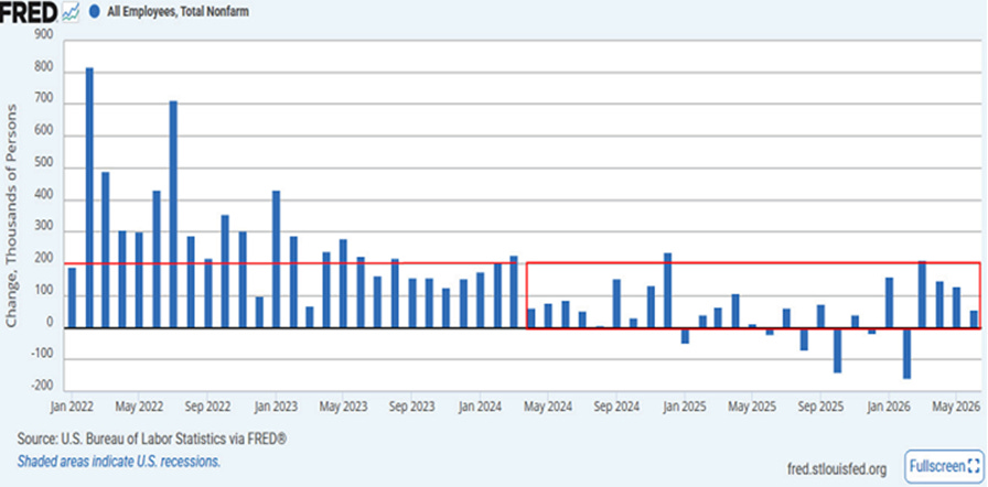
Above, we pick back up on our 21st century watch of the new jobs created metric by starting in January of 2022.
We chose this starting point to ignore the employment volatility of the Covid period – both down and then up again. By early 2022 the employment market began to settle in, if you will, but still had a few months of notable spikes, which reflected the ongoing reemployment, post-Covid.
As we moved on through 2022 and into very early 2024, the new jobs created metric continued to post results that were akin to our previous two-decade picture of our red line 200,000 level.
This has changed notably since that timeframe. In the year 2024, the new jobs created measure devolved into weakness relative to its history.
Our red rectangle begins in early 2024 and takes us out to the most recent update for June of 2026.
Underlining the change in behavior, the 200,000 red line (top of the rectangle) has become more of an achievement rather than the aforementioned historical pedestrian result it used to be viewed as. In addition, along the rectangle we see multiple months where negative employment results were posted.
Another angle for additional perspective
https://fred.stlouisfed.org/graph/?g=1X3Qc
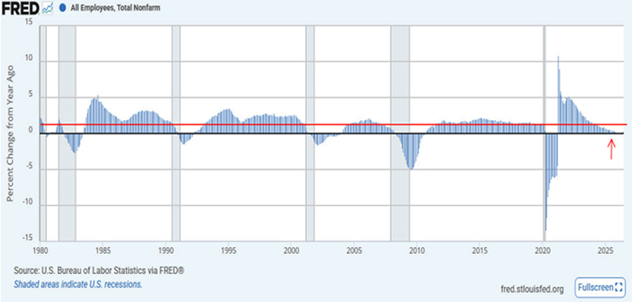
The above gives a much longer time perspective of the new jobs created metric along with a different way of observing the results.
We date the picture back to 1980 up to the most recent release for June 2026. A few decades give excellent historical perspective.
Each bar represents the year-over-year percentage growth rate of the new jobs created for each month.
Looking at the multi-decade chart in its wholeness, we see that our 1% year-over-year growth level, depicted by our red horizontal line, has in no way been a tremendous achievement.
Rather, like the historical 200,000 new jobs created level, 1% growth has been viewed as pedestrian. The 1% level has been easily attainable outside of the historical recessions and recovery from them, depicted with the vertical light blue shaded areas.
To the far right, our small red arrow highlights that the previous two years have remained well under this 1% year-over-year growth level. This underlines the previous picture in how the 200,000 new jobs created marker has been an aberration, far from the historical pedestrian result we had grown accustomed to.
As an aside, note with each passing decade that the 1% red line level has become more of an achievement, if you will, than the decade prior.
This is most notable upon reaching the 21st century via the year 2000 and how the results have acted relative to our red line. (The Covid time frame is an aberration for obvious reasons in light of an economic shutdown and then a restart.)
Yet again, the 21st century, when placed under any type of economic review, offers, that which should not be, at least when compared to history. The century of runaway money printing and government indebtedness has left in its wake, thus far at least, results that are less than ideal.
Squaring it up
We have weekly initial unemployment insurance claims that continue to post amazingly low claim levels. Clearly, via these initial claim results, the U.S. employment landscape is not cliff-diving with tremendous increases in job losses.
Simultaneously, we have been experiencing a strange employment backdrop when looking at the new jobs created results. Using history as a general guide via the above charts, we could surmise that the U.S. economy is slowly rolling into a recession. This would be if the new jobs measure were all that we consulted.
This seems to be a stretch when viewing the rock-solid stability in the initial unemployment claims data, as well as other measures not shared in this edition.
Artificial intelligence certainly is playing a role in this storyline.
On this note, as one example of many, when reporting earnings for JP Morgan on Tuesday of this week, the CEO noted all the company’s major businesses posted record revenue for the quarter.
Importantly, he noted AI has helped the bank cut up to 40% of jobs in certain roles. He added that most of those people were offered positions elsewhere in the company.
Using this example, there are minimal job losses and, at the same time, a reduced need for new hires.
Ultimately, the disconnects in the above employment pictures cannot hold forever. Marginal employment gains are not a recipe for long-run economic strength and vitality. For now though, while strange, the overall employment backdrop is not offering an imminent recession.
We are continuing to watch closely with an insatiable curiosity as to where this is heading.
I wish you well…
-Ken from Mind Your Stops